MUBI is a globally curated film streaming platform, production company and film distributor. A curated streaming service, it offers an ever-changing collection of hand-picked films, introducing one new film each day. The vision is to bring great, quality movies to everyone.
The streaming platform released its mobile app a few years ago. Users can browse through movies, see new MUBI releases and watch them on their mobile phones/tablets. I use the app quite frequently but couldn’t stop myself from complaining every so often.
So, I set out to redesign it.
(12 weeks)
UX Research & Design
Google Forms

My initial motivations were simple enough - redesign the existing functionality to improve usability. This meant reworking the visual design, simplifying user flows - all in all, making the app enjoyable (and less frustrating) to use. The app currently appears to be somewhat dated and does not adhere to modern design and architecture guidelines. My aim was to, therefore improve the information architecture and make app navigation seamless and intuitive for the user.
User research, however, opened up a few themes and ideas that I was excited to explore further. While MUBI does a great job in curating high-quality content, it lacks in leveraging this to engage the user enough. Moreover, I discovered that app usage was restricted to certain areas only. So I wanted to come up with recommendations that would help the app stand out and increase user engagement beyond their current usage.
Improve app infra to simplify user flows and make key fuctions more accessible
Enhance community-centric experience
Increase in-app interaction and communication amongst users
1. Contextual inquiry
Understand company’s vision and its fulfillment
2. Understand Users
Interview users to understand usage habits
3. User Persona & Design Concept
Devise a user journey based on the insights
4. Feature Prototyping
Design lo-fi and hi-fi prototype with user flows
Accessibility
The platform did a great job of achieving Accessibility and Quality. MUBI’s catalog involves a wide range of feature-length film, documentaries, and short films etc. from all around the world. Users can watch these on the app as well. The movies offered are in HD or in the next best possible restored format.
With that said, themes of Community and Sharing were hard to pinpoint. Users can share movie titles across other apps and see reviews/ratings from other members.
But with such an expansive catalog, I felt MUBI could do more.
I chose to do semi-structured interviews because I wasn’t sure what I was exactly looking for. I wanted to understand broad usage patterns, attitudes, feelings and movie-watching habits of my target audience, something that would be difficult to capture using questionnaires with exact answers. Semi-structured interviews allowed me to stick to some research questions while also being flexible to explore new ideas and themes with the participants.
What comes to your mind in terms of MUBI and community?
The idea was to obtain some common themes that I could then use create more directed questions and formulate a design concept.
** In retrospect, I should not have restricted myself to a single, somewhat vague question. Participants took some time to process and explain their understanding of what “Community” means to them. It was hard the first few times. Thankfully, I was able to identify some recurring themes that I could redirect my other interviews towards. **
Based on the themes, I asked the following questions to participants for a more direct, detailed discussion -
Do you follow members’ activity on MUBI? In what form? Why or why not?
What factors contribute to your deciding on a movie?
How do you share movies with friends?
How do you interact with other people about the movies you’re watching?
How do you find people with similar interests in movies?

To check off movies she has watched easily.
To exchange recommendations with friends and acquaintances alike, aka without having to socialize a lot.
Forgetting to update this list with content from multiple sources
Keeping track of her own recommendations for different friends based on their interests

To see their movie lineup so he can decide if he’s interested in attending them or not.
To socialize with people and build friendships
Not knowing if he’ll be able to meet people with similar movie tastes as these events.
Time to make MUBI synonymous with a Community & Sharing platform!
I narrowed down my focus on two main ideas -
A feature that would help people keep track of their recommendations while also interacting with their friends about it. I decided to focus on the idea of recommendations and sharing movies across members on the platform. Participants said that they did not follow any fixed mechanism for sharing movies recommendations. Watchlists failed to capture enough context behind the recommendations.
A feature to help users discover events around them and socialize with fellow attendees. This would allow people to socialize with fellow movie lovers in and beyond the confines of an online world. Participants expressed dissatisfaction at not knowing what events to go around them. They mostly relied on Facebook for this purpose, but the information would often prove to be unreliable.
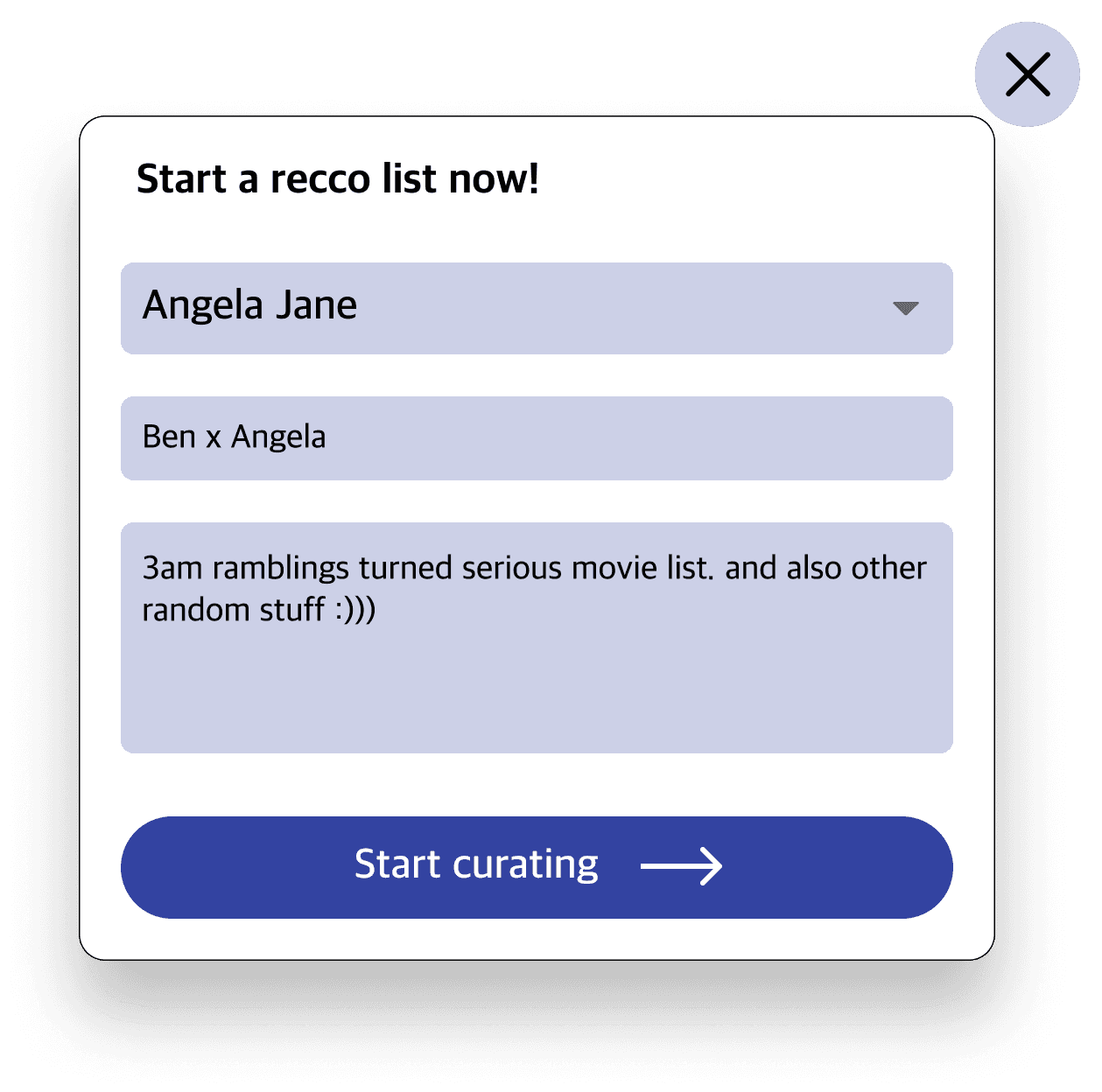
Recommendation exchanges between friends (or as I call them “Recco Lists”)
An “Events” directory that would help users find movie screenings, film festivals etc. around them and befriend other attendees, thus fostering a community for film lovers.
I also reworked the information architecture based on user feedback of the app being very clunky.

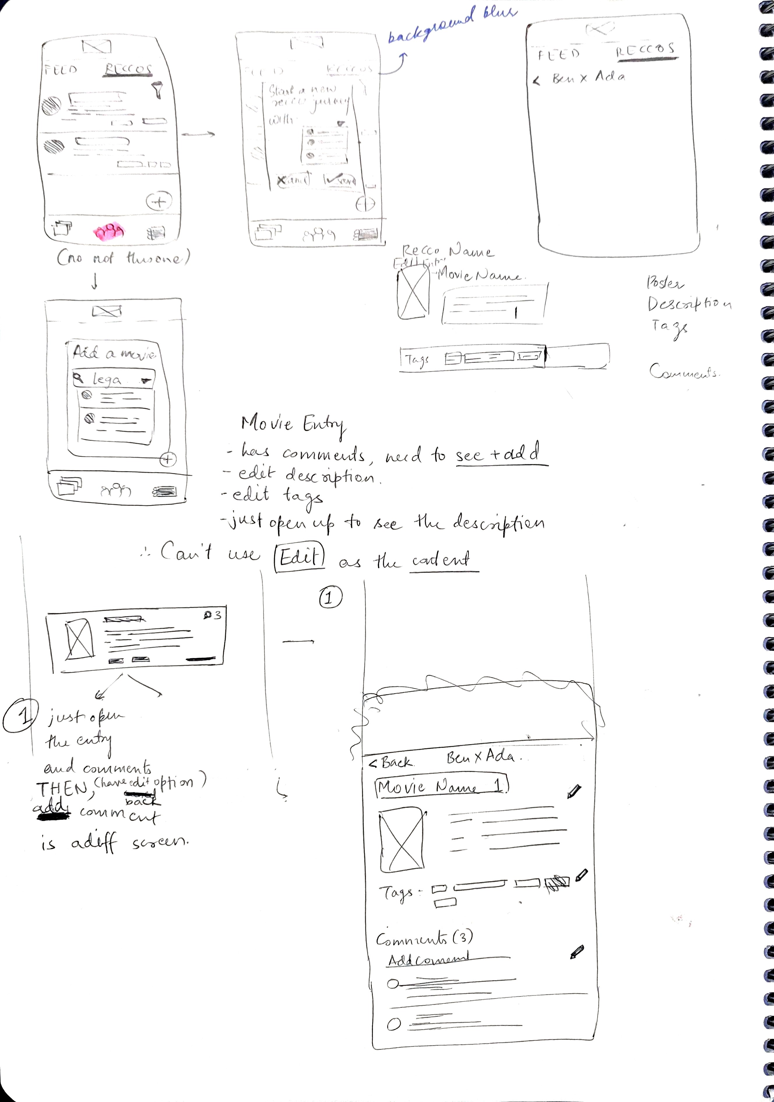

Tell your friend what you thought about the movie
User can let exchange thoughts about the recommendation about individual movies.


Seamless navigation
Tags and description for individual movies to document the motivation behind the suggestion
Users can filter through the entries via tags


Keep track of reccomendations
“Reccos” to exchange recommendations between friends
Users can create separate recommendation lists with their friends with description and update them periodically

See what your friends are up to!
“Your Feed” that chronicles friend activity such as reviews, likes and ratings
While previously reviews and ratings were nestled away deep within a movie card, users see what their friends are watching in a dedicated space of its own.
Users are directed towards this page as soon as they open the app. This is in an attempt to direct more visibility towards the “Community” aspect of MUBI and incentivize users to like, comment, share reviews etc.
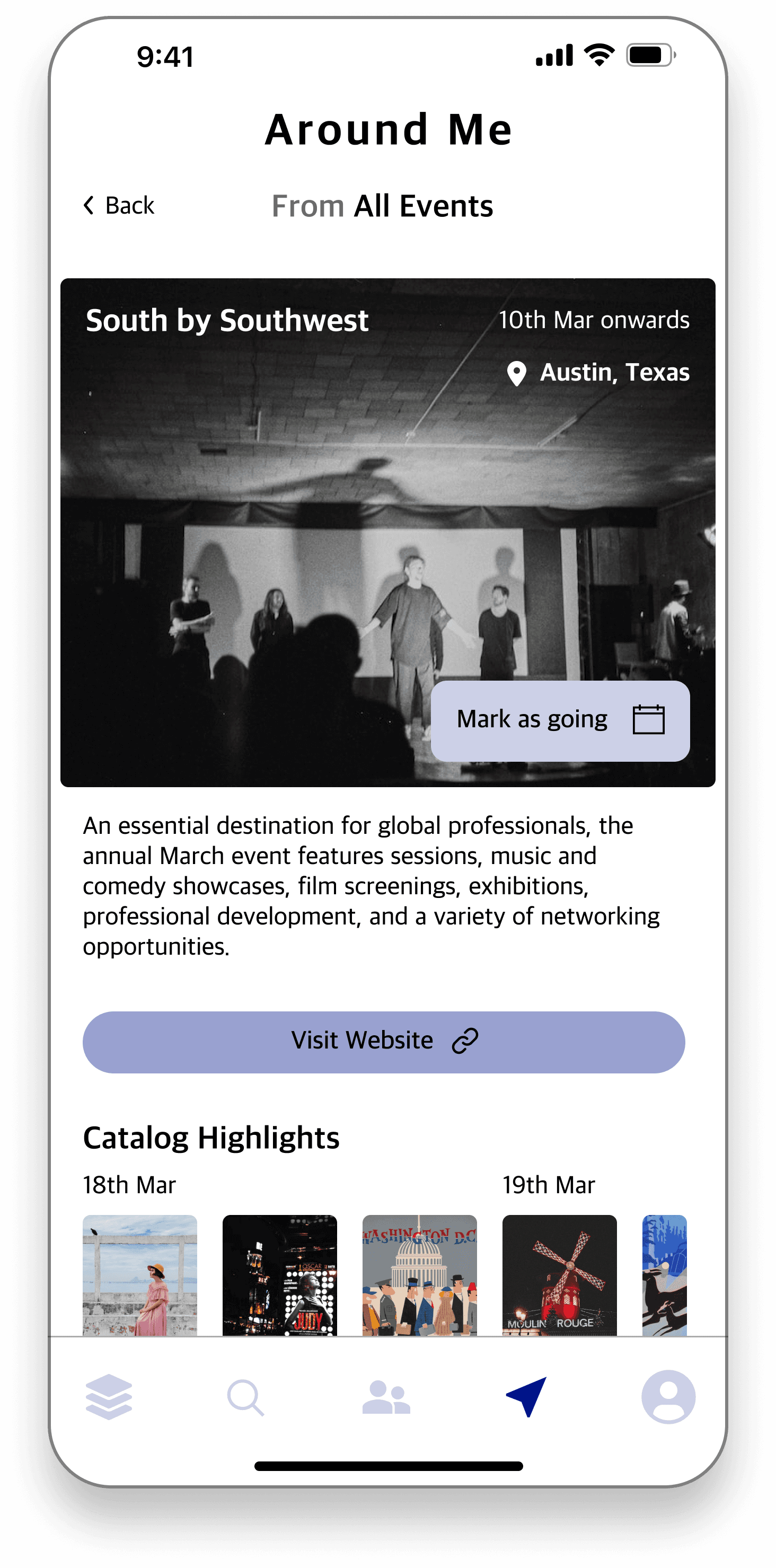
See upcoming events
Events categorized according to the type, ranging from mega Film Festivals to smaller, localized Screenings or discussion meetups
Users can see the distance from their current location and also who all are attending
All details in one place
Various event details such as dates and website links allow users to get all the information without having to leave the app.
Users can also mark themselves as “going”. This would notify their friends of the same
Catalog Highlights lists the movies to be shown on each day in case of a festival, as a quick overview for the user to see what they’re interested in.

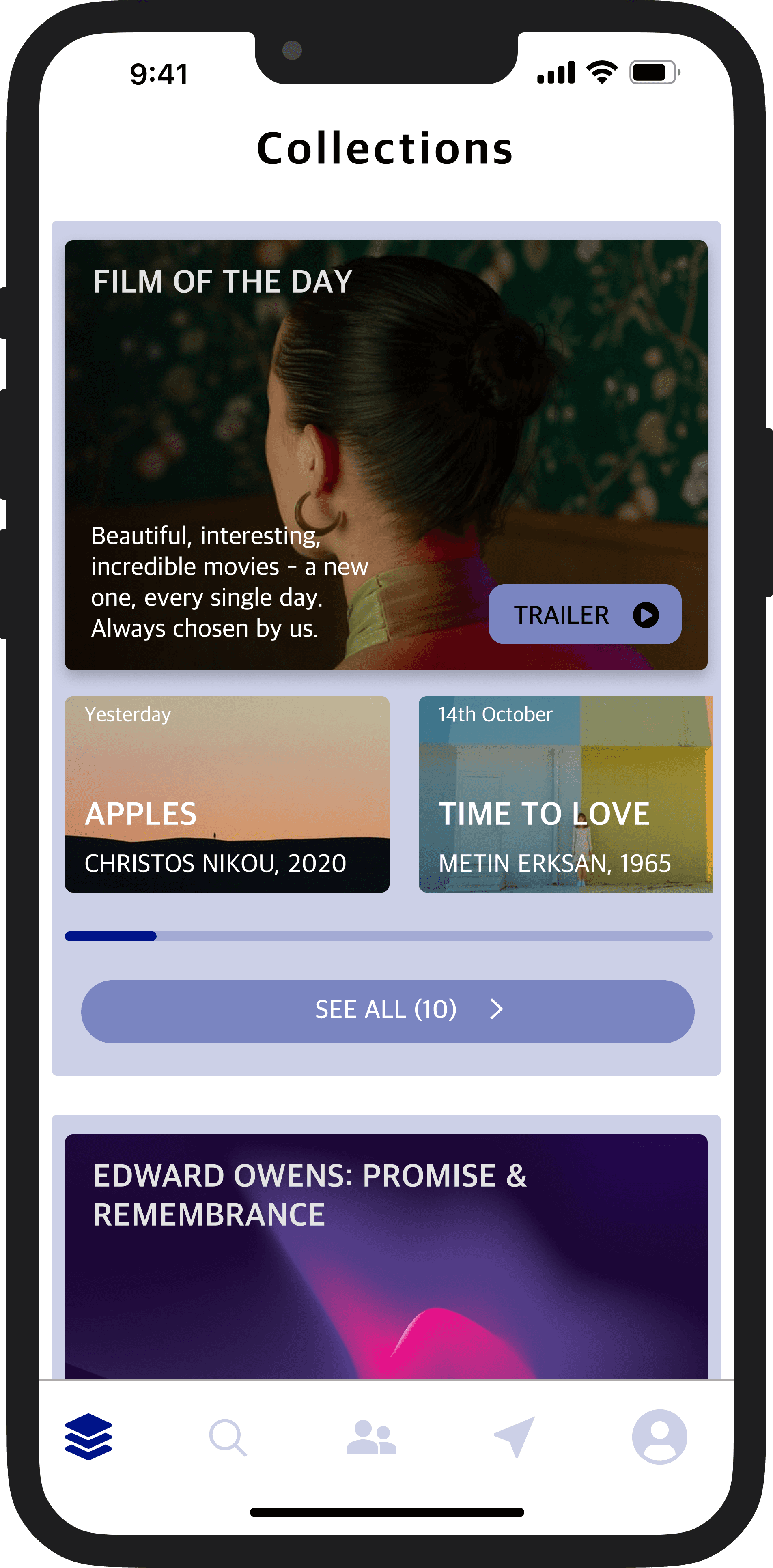
“Collections” to find movies easily
Reworked the information architecture to organize films under one banner - collections.
Users complained of a busy, confusing interface that made it hard to discern different movie titles. “Collections” combines MUBI Releases, Film of the Day, Best of Lists and many more under one banner and with a uniform design language.


Participant #1 remarked that they would prefer such the Recco-list feature as currently their reccomendations from friends are spread out across notes, apps and watchlists or buried in text messages.
Participant #4 also echoed those thoughts, remarking that the feature helps them “make lists, but better”.
This was my first-ever UX project, on something I’m really passionate about! Needless to say I failed a lot and learnt a lot. There were moments of self-doubt but I’m immensely grateful for all that I learnt throughout the process. It was enjoyable and very fulfilling. To my future self though, I’d say the following -
Welcome all feedback. When starting off, I would be bothered about receiving contrary or inconsistent feedback. Rather than attempting to design for everyone, it’s better to design for a few but design it well.
Don’t try to cover all bases. I attemped to check a lot of boxes when approaching the project, and was working on developing multiple features at once. it would be better to focus on one and design it end-to-end.
Iteration. Don’t fall in love with your designs. You’re ultimately creating something for the user, not yourself. Remember that and be prepared to iterate on your work.