Usability Study - Canvas
Identifying areas for improvement in Canvas to enhance the user experience for students
Skills & Tools
Heuristic Evaluations
Competitive Analysis
Moderated User Testing
SUS Analysis
Figma
Figjam
Google Docs
Timeline
12 weeks
(Sept-Nov, 2022)
Team
I worked in a team of 5 UX Researchers
My Role
My role was that of a UX Researcher. I collaborated with my team members in conducting heuristic evaluations, competitive analysis, conducting a test plan, and recruiting participants. I also moderated and/or took notes during each user interview.
Background
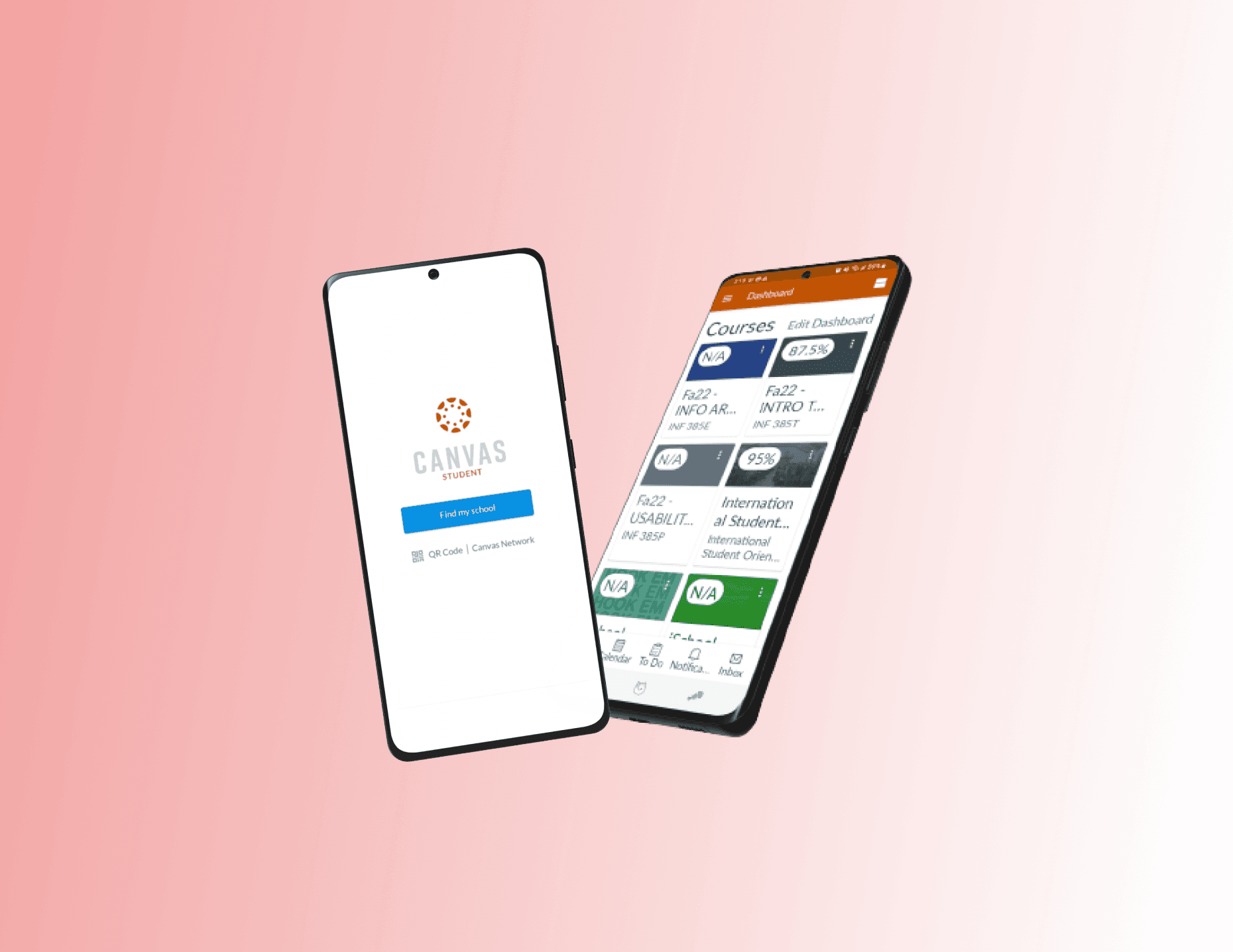
We decided to conduct usability testing on Canvas mobile application as part of a course project. Canvas is an online platform where students can access their classes from any device while on the go. Students can use the app to -
View grades and course content
Post to discussions
Submit assignments
Keep track of coursework with a to-do list and calendar
Send and receive messages
Take quizzes
01: WHY & HOW
Research Objective & Goals
1.1 Goals
We chose Canvas as it is one of the most ubiquitous platforms for students around us. We’ve all had numerous complaints and frustrations and occasionally design recommendations that we hoped to dig deep into through this study. The purpose of this study is to test the usability of Canvas and gather feedback and insights to help improve the application.
1.2 Objectives
We wanted to find answers to the following :
What are some features or designs that users like?
What are the designs that users find difficult to use or navigate?
How might we improve on these designs?
UX Roadmap
Heuristics
Conducting heuristic evaluations of a variety of flows on a 3-point scale
Competitive Analysis
Competitive analysis with direct, indirect and niche competitors to understand shortcomings and unique features
Recruitment
Formulating a test plan and moderator script, screening participants and conducting a pilot study to validate the test plan
Interviews
Conducting moderated in-person interviews with 10 participants and collecting observations and feedback
Synthesis
Drawing recurring themes and making design recommendations to improve the user experience
02: WHAT DO WE KNOW
Heuristic Analysis
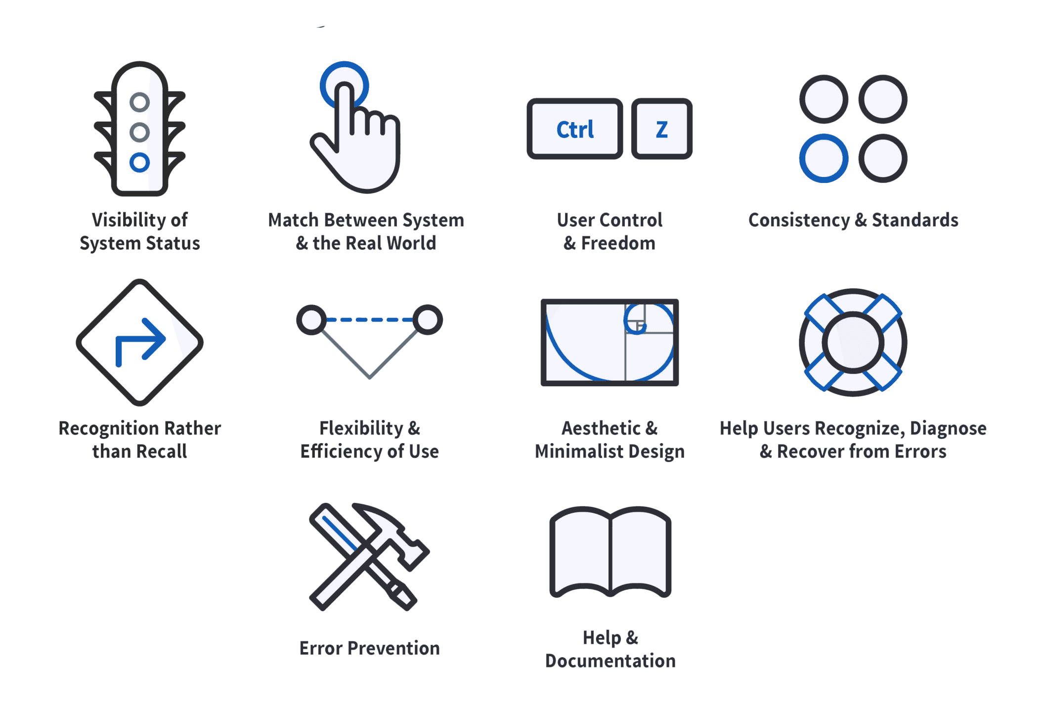
We focused on the task flows that we believed to be the most crucial from the students' viewpoint. Then we evaluated the screens of these task flows heuristically using Jakob Nielsen's design principles.
Following is a top-level heuristic evaluation of the first two task flows. Here's the full report
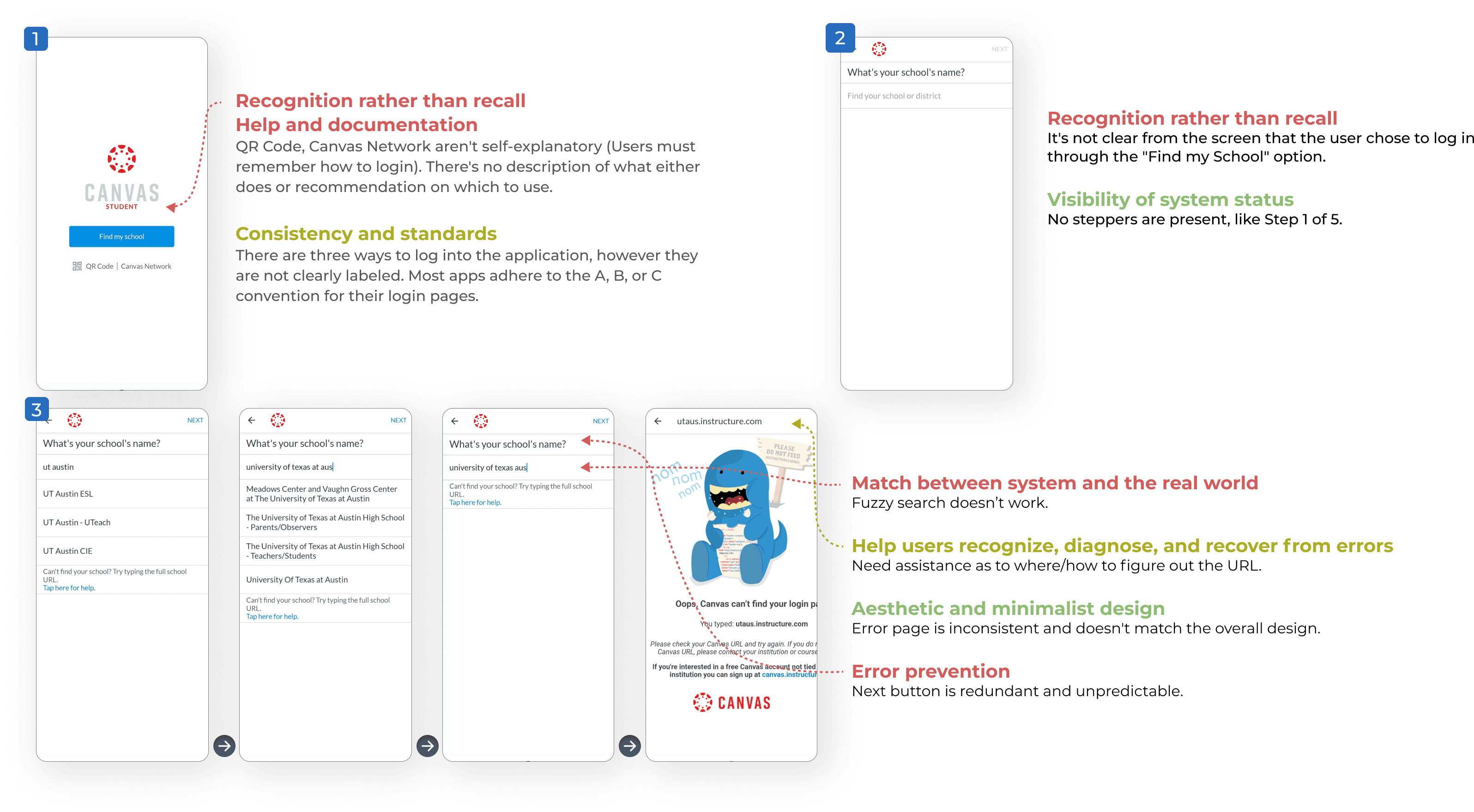
Task 1 - Logging in
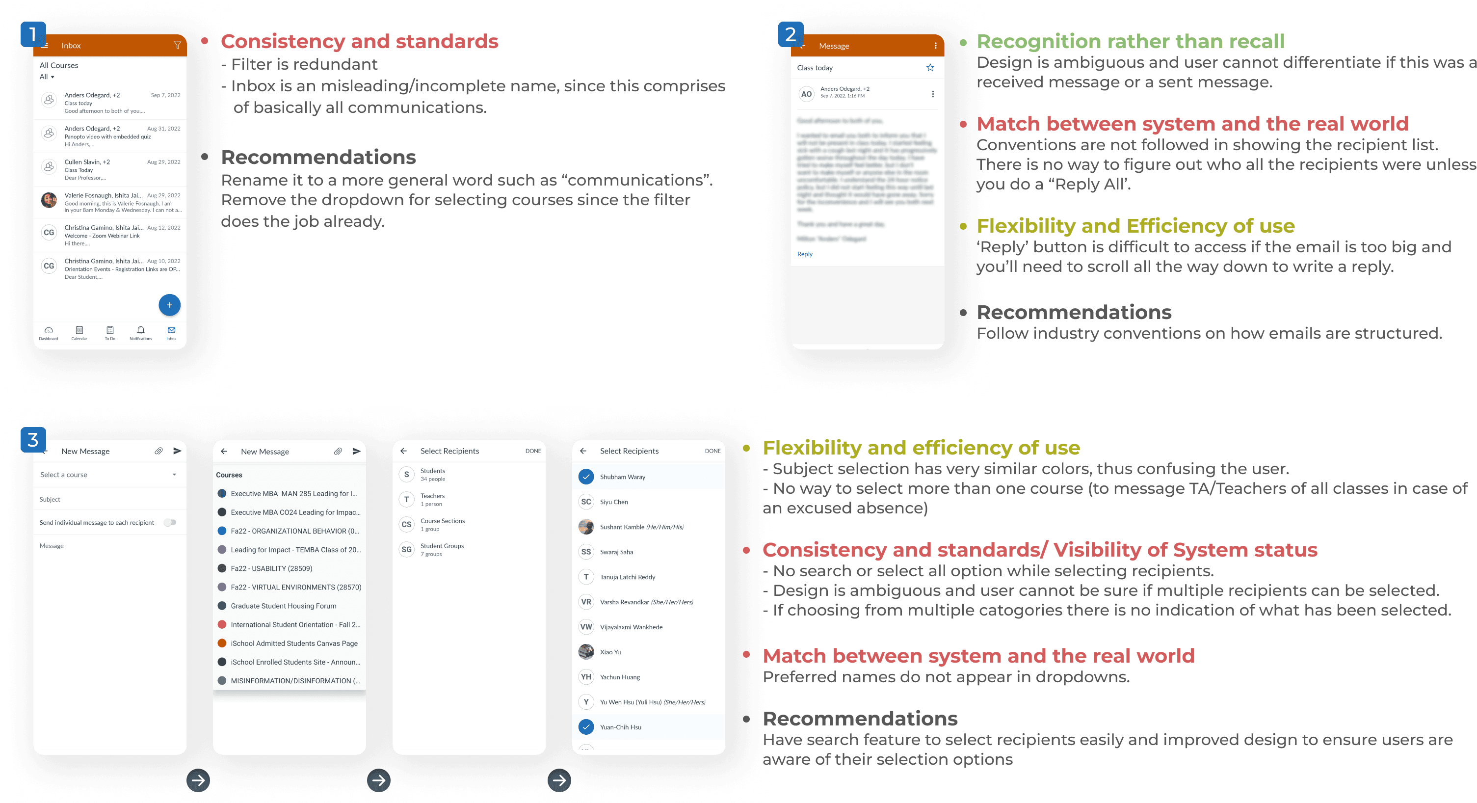
Task 2 - Inbox: Checking and Sending Messages
03: WHAT ARE OTHERS DOING BETTER/DIFFERENT
Competitive Analysis
We conducted competitive analysis to understand what competitors exist in the market in the ed-tech space. We mapped out the strengths and weaknesses of each of these against Canvas to gain a better understanding of what was being done good and what could be done better.
The analysis was performed for three different kinds of competitors -
Direct Competitors: Blackboard, Moodle, d2l and Google Classroom
Indirect Competitors: Kahoot, Coursera, and Microsoft Teams
Niche Competitors: Gmail, Slack and Google Calendar
3.1 The Approach
For each of the competitors, we analysed their designs in terms of the features we were focusing on, and any other features they may have that warrant attention or make for good user experience.
We decided to include Niche Competitors in addition to Direct and Indirect ones, as we believed that their design guidelines have now come to be accepted as the norm. Canvas uses numerous such features, like Inbox, Calendar etc. where improvements could be made according to our heuristic evaluation.
3.2 The Analysis
3.3 The Insights
We gained two main insights from this analysis as follows -
A consistent design language -
Platforms like Google Classroom and Blackboard fared better in our experience because of a consistent, intuitive and predictable design language. Since a major user base for LMS systems are teenagers and young adults, a minimal and modern design is more appealing and easier to understand
Design paradigms in terms of in-app emails, calendar and to-do lists within Canvas were not in line with niche apps such as Gmail or Slack that are ubiquitous in our lives these days.
Feature Discovery -
We found ourselves often jumping to conclusions about some features we particularly liked in other apps that were absent in Canvas. However, a little research would tell us that Canvas in fact has a plethora of features with more flexibility.
But these were difficult to understand since the information architecture of the platform makes it difficult to navigate and actually discover these features
04: WHO TO TEST WITH
Recruiting Participants
We decided to conduct all our user tests in person. Since we’ll be analyzing a mobile application, in-person testing would best help us understand problems that they face or any confusion they may have owing to bad design.
We focused on participants who were living in and around the UT Austin campus for this purpose. For selecting participants we sent out screener and got about 19 responses, from which we further selected 10 most suitable people for our test.
Total Participants
19
Ages
21-28 yrs
Experience with Canvas
4 were well-versed
6 were moderately familiar
Miscellaneous Attributes
1 participant was also using Canvas as an Educator
4 participants had previous experience with other LMS applications
All participants were enrolled in 3-4 courses for the semester
Education
UT Austin Grad Students
05: HOW TO TEST
Testing Methodology
5.1 Feedback from Pilot Testing
After finalising our moderator script and all the technological aspects of our user interview we decided to do a pilot test before actually starting with the interviews. The following was the major feedback we got from the pilot test -
The number of tasks were less and we won’t get enough data about the app from the same.
We need a better setup for recording audio video, we initally thought just a person holding phone and recording would be enough, but it was disturbing the participant.
Unknowingly, moderators were directing the pilot while they completed the tasks, which could have led to inaccurate findings.
We went ahead and updated our moderator script and interview setup to avoid the above noted mistakes in the final usability tests.
5.2 Data Collection
All tests were conducted in-person
Test duration was 30-35 minutes
We created a template in Google Docs and Google Sheets that was used to record observations during the test.
5.3 Note-taking
1 moderator would interact with the participant.
1 timekeeper and at least 2 note-takers at each test.
Participant video and audio was recorded with their consent.
Screen recordings were performed with Apple’s continuity camera feature.
06: WHAT DID WE TEST
Testing
Below is an exhaustive analysis of the first two tasks. The full report can be found here.
Task 1 - Login into the Application
Scenario
I just found out that Canvas has a mobile application and decided to download it. I need to log in through the main way and an alternative way.
Statistics
80% participants completed the task
Average User rating - 4/5
Average time taken to complete the task - 1.49 minutes
“"
I wouldn’t have ever clicked on the QR Code button if I did not do this test
Task Flow
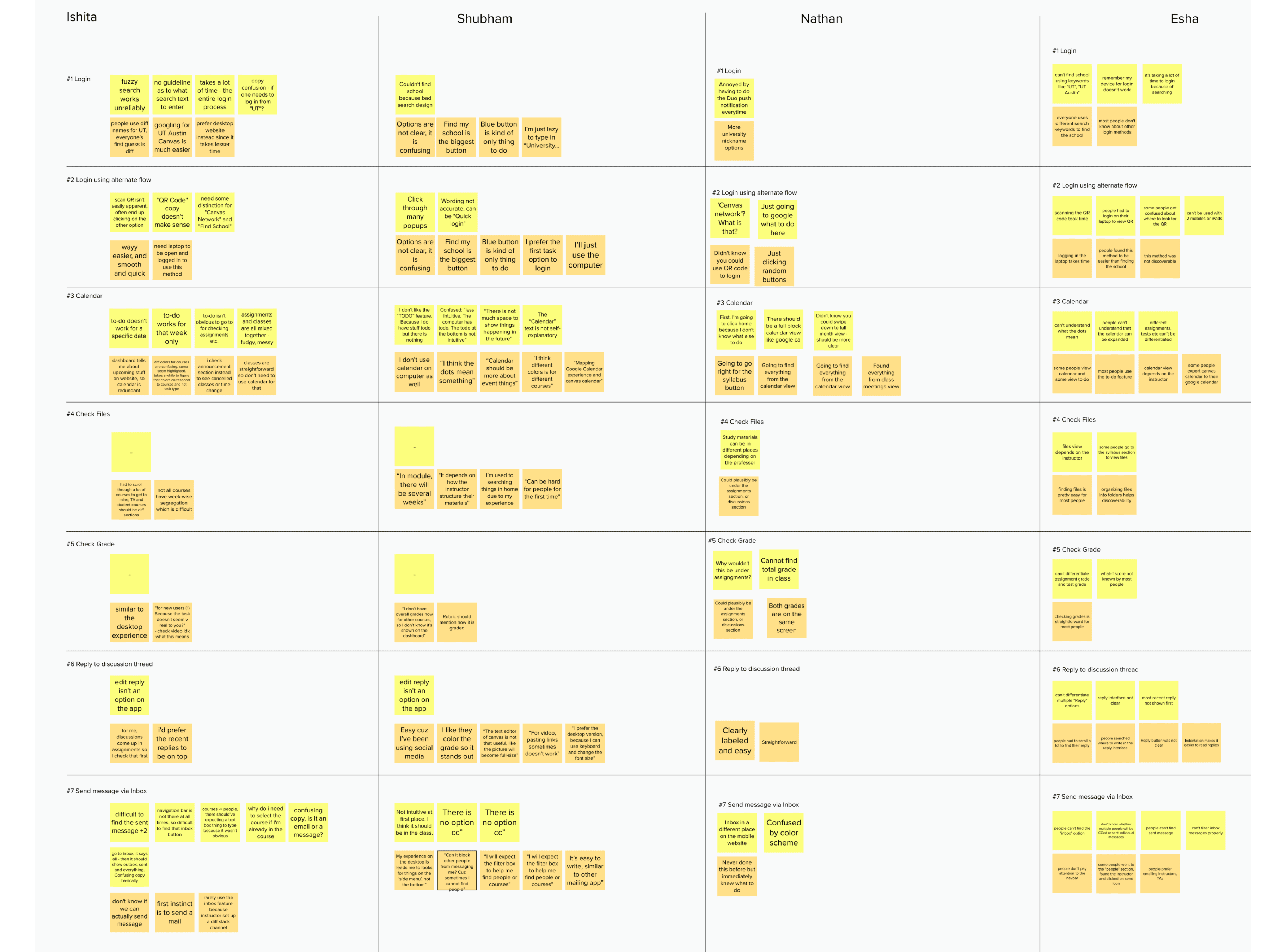
Observations
People use different names to refer to UT, such as UTAustin, UT at Austin, Univ. of Texas etc. However, the search functionality does not support Fuzzy Search resulting in confusion and frustration.
The entire login process takes quite a lot of time.
One participant said he would simply Google search “UT Austin Canvas” since the in-app search was difficult.
Participants also said expressed confusion with the copy.
Analysis & Recommendations
The application's first screen says "FIND MY SCHOOL," which is misleading for the user because it does not specify if it is for logging in, learning more about the school, or something else. Similarly, the QR Code and Canvas Network options are ambiguous in terms of functionality.
There are two options to log in to the program, but neither clearly states on the screen that they are intended for signing in to the application. It should have appropriate wording informing the user of the operation of the buttons. The third option is unclear even after clicking on it, remove the button if the functionality is not needed.
Have steppers and their descriptions to inform users of where they are in the login process.
Have clearer instructions on how to find school URL and employ fuzzy search. The error page should not redirect to another native web screen.
The search does not perform properly and requires improvement in order to produce accurate results. Multiple results are displayed for the same search, making it harder to find what you're looking for. Display the result according to the best match to the search requested, incorporate commonly used names for colleges like UT Austin for Univerisity of Texas at Austin.
Need highlights to visualize the relationship between the recommendations and the input text. Make the the keyword bold in each search result.
Task 2 - Send a Message
Scenario
You have a doubt about an upcoming exam and need some clarifications from your instructor. Send a message to the instructor Nathan and classmate Esha.
Statistics
90% participants completed the task
Average User rating - 3.3/5
Average time taken to complete the task - 3.04 minutes
“"
I just sent the message but I don't know if I was successful.
Task Flow

Observations
Participants were not confident about their approach. Most people did not know with certainty where they needed to go in order to send a message.
Participants almost always went to a specific course and then clicked on the instructor’s name to send them a message. Only one participant leveraged the “Inbox” button on the bottom navigation bar.
There was an immediate expectation for the messaging functionality to mirror what other standard apps such as Gmail do.
Analysis & Recommendations
Multiple buttons with repetitive options. There are two 3-dot menus that have the same options across them to reply to messages etc. This is redundant, and only one button ought to be present
There’s no feedback about the message being sent successfully. When users send a message, provide them with an unambiguous success or failure confirmation. Once the message has been sent successfully, display it right away.
Reply button is difficult to find. To avoid having to browse through the entire message, display the Reply button as a button rather than a link fixed at the bottom of the message.
07: WHAT we found
Analysis
7.1 SUS Analysis

7.2 Task-wise affinity mapping
7.3 Key Insights & Recommendations
01
Information Architecture Overhaul
We discovered numerous features that we previously weren’t aware of, through our usability testing. A feature that allows one to calculate an approximate grade based on the scores they hope to get on their remaining assignments is a unique feature. However, barring one, none of the participants knew about it. This points to the overall information architecture that prevents discoverability of its features.
02
Flexibility is a trade-off
We realised through all the tests and user feedback that Canvas infact has a multitude of features with immense flexibility and customizations. Instructors can customize their course pages according to their class structure. This, however, leads to multiple different layouts with very little consistency across different courses. Students don’t tend to have fixed patterns for navigation throughout the app and instead do it differently for each course. One of the participants remarked that they had missed out on completing a discussion in a course because they thought it would show up in the assignments section like their other courses.
03
Inconsistencies across different platforms
The application behaves differently on Android and Apple phones. For example, Apple users do not have the ability to search for a file whereas Android users do. There ought to be the same feature-set that can be leveraged by the users irrespective of their devices.
04
Faulty dark mode
The dark mode has not been well thought-out or properly implemented. The color changes across light and dark mode are inconsistent and often some options and/or buttons are invisible because of this color scheme. One of the participant was quite surprised when they discovered that files can be filtered based on specific criteria. This was because they had been using the app in dark mode since always.
Reflection
The methodology - This project really helped me get comfortable with conducting different aspects of a usability test.
Moderating tests - Moderating an interview for the first time was quite the learning experience. While I made some mistakes in the first one I ever conducted, I definitely got better with time, to the point that my teammates preferred that I moderate most of the tests.